Jump to a section:
Types of graphs and pictograms
This video shows different types of graphs you might want to use in your presentation:
Graphing tools and websites
Here are some websites you might want to use for creating your graphs:
- https://nces.ed.gov/nceskids/createagraph/Default.aspx
- https://www.meta-chart.com/
- https://www.mathsisfun.com/data/graphs-index.html
- https://docs.google.com/spreadsheets
Examples of good graphs and bad graphs
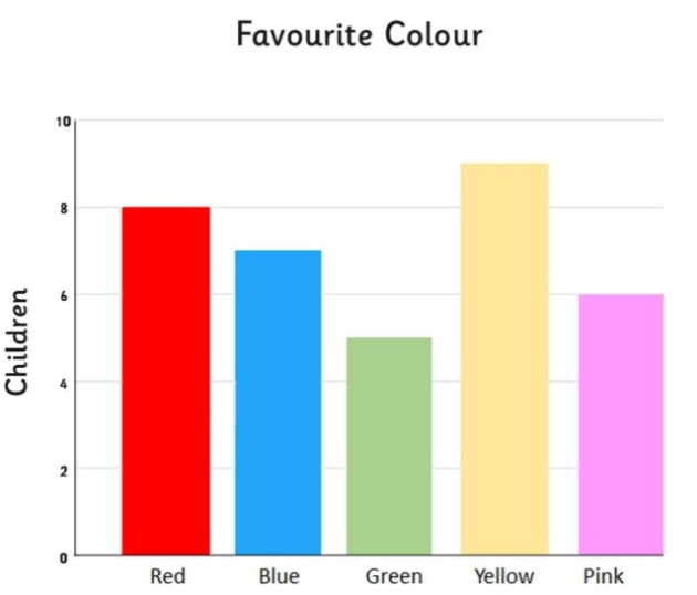
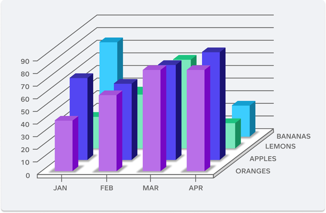
Bar graph:
A good bar graph has clear labels, bars of the same width, and different colours to represent different data. Avoid squishing bars together or forgetting to label what they show.
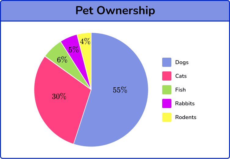
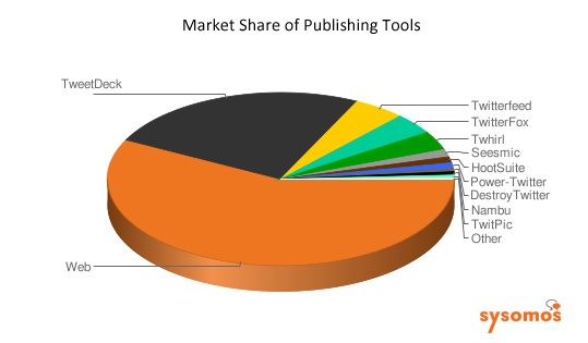
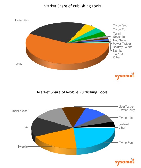
Pie chart:
A good pie chart has neat, colourful slices that add up to whole pie (circle). Having up to 5 sections makes the pie chart easier to read. Avoid using too many slices and creating them in 3D.
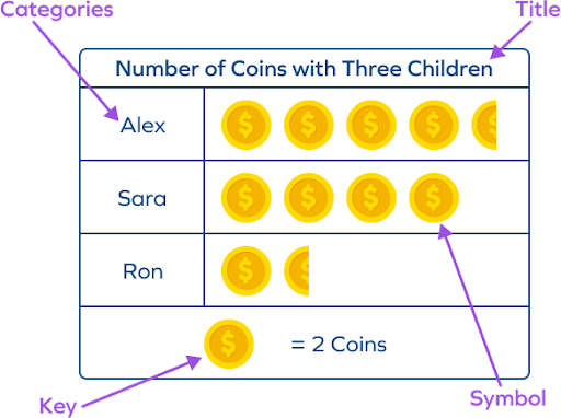
Pictograph:
A good pictograph uses clear, simple pictures with a key that shows what each picture stands for. Avoid using pictures that are too small, unclear or missing a key.
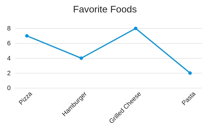
Line graph:
A good line graph has points joined in order with straight lines and clearly labelled axes. Avoid messy lines or skipping numbers on the scale.